
Branding and Identity
From month-long experimental theatrical events to weekend funk parades; corporate policy decks to nonprofit branding and identity systems; restaurant branding illustrations to mobile art gallery brand refreshes, I have worked on a wide range of branding and identity projects.
Below you will find some of my favorite projects that weren’t highlighted elsewhere on this site. Communication is the common thread that runs through all of these projects. It starts with deep conversations between me and the client and ends with a body of work that synthesizes clear communication with engaging imagery that tells a compelling story.
Airbnb Policy
Airbnb reached out to me to create a collection of illustrations that could be used across many platforms that their policy team uses to communicate both internally and externally. Each collection would include a repeat pattern with elements that could be used independently or combined with elements from other collections.
Combined elements from each of the four collections were used to create a robust Google Slides deck. The Airbnb Public Policy team has used this deck to create dozens of internal presentations with business leaders, as well as external presentations for lawmakers and Host groups.


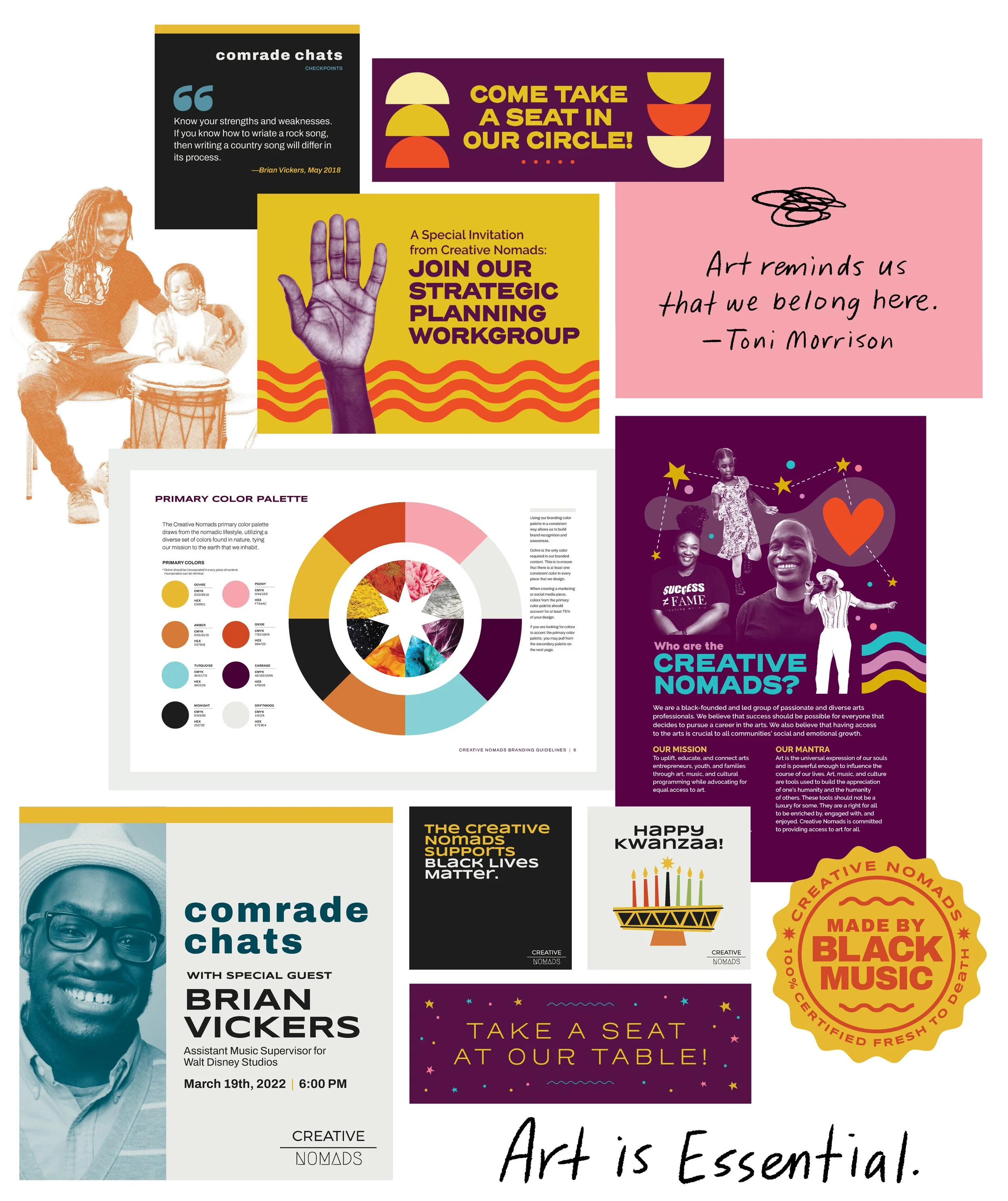
Creative Nomads
The Creative Nomads are a black-founded and -led group of passionate and diverse arts professionals who believe that success should be possible for everyone that decides to pursue a career in the arts.
When the Creative Nomads first launched nearly a decade ago, it was launched with two different logos which were used inconsistently and seemed to be tailored to two different audiences. It also had no branding or messaging guidelines.
I was brought onboard to create a fool-proof set of branding guidelines that team members could use and refer to when writing copy, seeking funding, creating content, and promoting events.
Branding guidelines included sections on tone and voice, typography, logo usage, primary and secondary color palettes, accessibility, photography usage, and more.
Halsa Restaurant
Halsa, a farm-to-table restaurant located in the Brookland neighborhood of Washington, D.C., approached me to create a robust set of branding illustrations that they could incorporate into nearly every facet of the restaurant. I was tasked to use these illustrations in my designs for the restaurant’s coffee cups, to-go bags, totes, sandwich wraps, postcards, and menus.
Several of the illustrations were blown up and wheat-pasted (by Three Ring Studio) onto the restaurant’s exterior. The large chicken was an Instagram-worthy, interactive piece that customers often came from out of town to see in-person.


CulturalDC’s
Source Festival
CulturalDC’s Source Festival was a month-long performing arts festival that highlighted full-length and 10-minute daring and ground-breaking plays as well as performance art billed as “artistic blind dates.”
I worked with CulturalDC on the branding for Source Festival for the final four years of its ten year run. Every year, we created a new identity for the festival which was tailored to the three overarching annual themes. In 2016, I got to art direct and collaborate with photographer, Daria Johnson, to create imagery using the actors and actresses featured in that year’s plays. My work for Source Festival earned me an AIGA50 award in 2018.


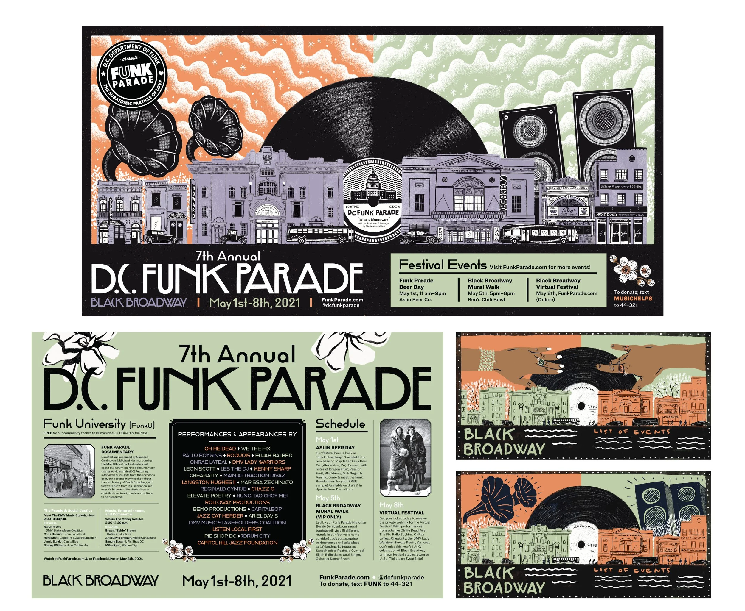
D.C. Funk Parade
My work with the D.C. Funk Parade spans nine years and marks the Funk Parade as my oldest client. As a funk-enthusiast, working with the D.C. Funk Parade team is a natural fit for me. Every year I have their full trust when it comes to identity and every year we expand the number of pieces that we design for the event.
When I started working with the crew in 2014, I simply provided them with an illustration that would be incorporated into a sponsor logo-heavy template. Flash forward to 2022, and we are now designing everything from web-banners, to door-hangers, street posters, unconventional tri-fold brochures, t-shirts and more.
Featured here, are two of my favorite themes: Keepin’ the Funk Alive, and Black Broadway (highlighting Chocolate City’s rich arts, music, and cultural history). Both themes feature a collection of illustrations and hand-lettered themes, in addition to a limited color palette and branding typefaces.